|
Mr. Cresswell asked his class to watch a video and make a prediction of what the graphs would look like, then record the time and distance and create an 'actual' graph. My first two prediction graphs were somewhat close to the actual graphs but my last graph was really off. My graphs was different from the actual graphs because I was unsure of how fast or slow the skateboard was moving. My graphs just weren't steep enough. My reasoning for my prediction graphs was that if the skateboard was going fast there was a steep line and if the skateboard was going slow then it was a more gradual line, when the skateboard reached the point where it went backwards I made the line go down showing the that it was moving back to the previous distances. The zeros of my graphs are either where the skateboard began or where the skateboard has gone back to the beginning. Each of my graphs only have one zero which is the origin. The maximums of the graph are each different, the 21 inch ramp graph shows that it has the highest maximum and then the 14 inch has less and the seven inch is even less. Each of the maximums are between 10 and 15 seconds. I believe that with the difference in the height of the ramps made it so the graphs have different maximums, with the highest ramp you get the highest maximum and with a lower ramp you a lower maximum. For the first two graphs the slope is rising the fastest at the beginning and the falling the fastest when it first starts to go backwards. The third graph also rises the fastest at the beginning but it does not fall, it stops. The slope is rising the fastest at the beginning because that is when the skateboard is moving the fastest, the skateboard has not had numerous amounts of friction to slow it down yet. It falls the fastest after it moves backwards because it is beginning again and has not had the friction to slow it down. 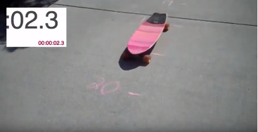
0 Comments
According to the parabola that I created in Desmos the ball barely makes it in the hoop. This graph is slightly inaccurate because I was unable to get the parabola through the middle of all of the basketballs, but I believe that it will go in after it hits the rim. 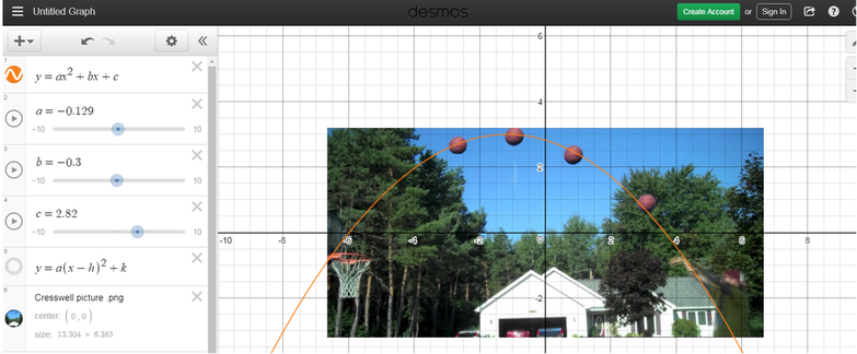 The image below shows six graphs, each have different relationships between time and the height of the flag. Graph (a) shows that in the time that it took to raise the flag, the flag was raised consistently. Graph (b) shows that in a short amount of time the flag was raised rather high and then the time to raise the flag slowed down. In graph (c) the flag is hoisted up a little bit and then there is some time that passes before the flag is hoisted again and the pattern continues until the flag reaches the top. Graph (d) shows that at first hoisting the graph is slow-going and then it speeds up at the end. Graph (e) shows that in the middle of the process the flag is hoisted at a large height in a short amount of time and then slows down until it reaches its maximum height. The last graph shows that at a certain time the flag was instantly at the top of the flag post. I would say that the most realistic of these graphs would be graph (c). To raise a flag you have to grab some rope and pull it towards yourself, grab some more rope and pull it some more. There is a pause when you go to grab more rope and the pause is represented in graph (c). Obviously, graph (f) in the least realistic of the graphs below. It shows that the flag is instantly hoisted to the top of the flag pole which is pretty impossible. 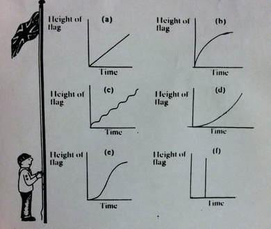 |
AuthorWrite something about yourself. No need to be fancy, just an overview. Archives
November 2017
Categories |
 RSS Feed
